Making figures with R
First published: January 13, 2019
Last updated: December 3, 2023
I use R for most of my data analysis and especially for making figures. There are a few things I constantly need to look up when it comes to fine-grained figure editing and graphics, as well as some best practices I picked up which have made my life easier. I'll present them below in the form of an example problem.
Check out my post on keeping plot styles consistent as well!
Making the data
In the spirit of making a reproducible example that you can follow along with, we will make the data from scratch.
For my PhD thesis project, I work on investigating neuron-glia interactions. This is fake data, but I recently wrote my comprehensive exam so this data is modeled after what I was working with for my project. Basically, I was measuring part of the neuron called the Axon initial segment and wanted to compare two different treatments.
To model this problem, I will just use two normal distributions with different means with separate labels. In this case, the names will be purposely awful so that we can rename them later. I'll also add other grouping categories so that we can segment the data in different ways.
  # make two normal distributions with different means and n's
  set.seed(42) # reproducibility
  vals <- c(rnorm(mean=22,sd = 3, n=120), rnorm(mean=18,sd=3, n=120))
  # now labels
  names <- c(rep("untreated", times=120), rep("treated", times=120))
  samples <- rep(c(rep("a1", times=40),rep("a2", times=40), rep("a3", times=40)), times=2)
  data <- data.frame(names, vals, samples)
  head(data)
      names     vals samples
1 untreated 26.11288      a1
2 untreated 20.30591      a1
3 untreated 23.08939      a1
4 untreated 23.89859      a1
5 untreated 23.21280      a1
6 untreated 21.68163      a1
Useful libraries and standardizing settings
Now that we made the data, let's start playing with it. Here are the libraries I commonly use for figures.
library(dplyr) # essential!
library(ggplot2) # plots
library(ggpubr) # signif levels on plots
library(latex2exp) # annotating plots
You'll see what we use these for as we go, but briefly:
- dplyr is essential for organizing data for plotting.
- ggpubr for adding statistical significance and testing directly to plots.
- latex2exp adding \LaTeX{} symbols to your plots
You want the figures you make to have a standard look and style to them. I typically use ggplot2 along with cowplot, which provides nice defaults on top of ggplot for scientific plotting.
If you want clean plots and granular control over your styles, see the code block below which I add to almost every script or RMarkdown document I make.
  ####### defaults for lots of plots #########
  theme_and_axis_size <- theme(legend.position = "None", # you can add legends to your plots by adding +theme(legend.position = ...) where ... is the position.
          text=element_text(size=16),
          axis.text = element_text(size=15, face="bold", color="black"),
          axis.line = element_line(color = 'black', size = 0.6))

  theme_set(theme_classic() + theme_and_axis_size) # Global setup for ggplot2 of your defaults.

  color2_standard <- scale_color_manual(values=c("black", "red"))
  fill2_standard <- scale_fill_manual(values=c("black", "red"))
  base_pallett <- "Paired" # BuGn is also good and BrBG
  statsize <- 5
  starsize <- 10
You'll see how we use these variables will be explained as we go, but the idea is that we set the main plot style variables globally, and then we can adjust the groups by changing these settings in one place and propagate to all the plots we make.
theme_and_axis_size stores ggplot2 standard size and legend options. This one is really important for having the same text size and style for all your your plots
theme_classic() is a is a white background plot without gridlines, as opposed to the grey plot with gridlines in default ggplot2.
theme_set() sets the theme variables globally for your session. When I type theme_set(theme_classic()+ theme_and_axis_size) I set all those variables as defaults without needing to add them to every plot.
Of course, if you want to add more specific values or things to individual charts (maybe you do want a legend), it is easy to add a separate theme() option to that specific plot with your options.
Since I am only plotting two classes for most of this example, I used black and red as my color options in scale_color_manual and scale_fill_manual. I would otherwise use http://colorbrewer2.org/ to pick a colorblind-safe and pretty palette like Paired or PRGn. Storing it as a variable makes it easy to change for all your plots.
statsize and starsize are for the significance plots.
I might make a lot of drafts of plots before I decide on a common style. I like this method of setting my defaults at the top of my script and then customizing them as I go. A consistent clean style makes a really big difference and shows you care about your data and your presentation.
Renaming variables, re-ordering columns, and renaming columns
The data looks like so:
head(data)
      names     vals samples
1 untreated 26.11288      a1
2 untreated 20.30591      a1
3 untreated 23.08939      a1
4 untreated 23.89859      a1
5 untreated 23.21280      a1
6 untreated 21.68163      a1
If we make a quick plot of it, say a boxplot:
  ggplot(data, aes(x=names, y=vals, color=names)) +
      geom_boxplot() +
      color2_standard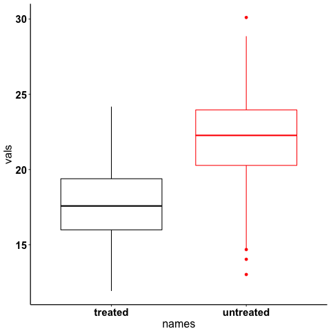
Option 1: Renaming variables with if_else() and case_when()
ggplot2 orders variables in alphabetical order, so our untreated (aka control) is shown before our treated (aka experimental). Not ideal. One way to fix this is to rename the variables. This can be done like so:
  data  %>%
      mutate(names = if_else(names=="untreated", "control", "treated"))  %>%
      head()
    names     vals samples
1 control 26.11288      a1
2 control 20.30591      a1
3 control 23.08939      a1
4 control 23.89859      a1
5 control 23.21280      a1
6 control 21.68163      a1
if_else()works great for dichotomous variables. However, if you have a bunch and you want to rename them all, use case_when().
  data  %>%
      mutate(names = case_when(names == "untreated" ~ "control",
                               names ==  "treated" ~ "experimental",
                               TRUE ~ "UNKNOWN"))  %>% # and so on for more cases. Add the TRUE case to catch all others.
      head()
    names     vals samples
1 control 26.11288      a1
2 control 20.30591      a1
3 control 23.08939      a1
4 control 23.89859      a1
5 control 23.21280      a1
6 control 21.68163      a1
if_else and case_when() would solve the problem. Note when using case_when() if you don't catch all the cases the other rows will become NA. Assign your own "just in case" value which you can easily check for later.
A more general, less destructive solution would be to re-level the factors. I will use forcats to demonstrate this.
Option 2: Reordering factors
Note: in the code below I am not going to import the entire forcats library, because I only need one function. Instead, I will use 'inline import' to grab the one function I need. This is useful if you only need one function and don't want to load the whole library, or if you think that two libraries have functions with the same name and you aren't sure which you loaded first. In R, you inline import like so: libraryName::functionName. Read it as, "from libraryName use functionName". You can do this with any function from any library, including base R. This is actually great to do because it is more explicit.
fct_relevel is the function we need (docs).
data$names <- forcats::fct_relevel(data$names, "untreated")Now plot it again:
  ggplot(data, aes(x=names, y=vals, color=names)) +
      geom_boxplot() +
      color2_standard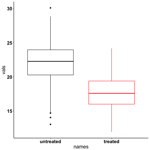
We just re-ordered the variables without re-naming them. Note that fct_relevel accepts a vector, so from our data frame, we selected the column, then just put the variable we wanted first as the next argument. Then we assigned it back to the original column name.
Renaming columns
  data  %>%
      rename(NewNames = names)  %>%
      head()
NewNames vals samples 1 untreated 26.11288 a1 2 untreated 20.30591 a1 3 untreated 23.08939 a1 4 untreated 23.89859 a1 5 untreated 23.21280 a1 6 untreated 21.68163 a1
rename is from dplyr. The argument order is NewColumnName = OldColumnName
Paired plots
We have two grouping variables in this dataset. Let's say measurements were paired, and we wanted to show both the paired differences and the overall boxplot.
Summarizing and making a paired plot
NOTE this can be done more simply with built-in ggplot functions like stat_summary(), which will be added in a future post.
We can brute force this problem by making a summary like so:
  summarized_data <- data  %>%
      group_by(names, samples)  %>%
      summarize(mean_val = mean(vals),
                sd_vals = sd(vals), n = n())  %>%
      mutate(sem_vals = sd_vals/sqrt(n))
  summarized_data
# A tibble: 6 x 6
# Groups:   names [2]
      names samples mean_val  sd_vals     n  sem_vals
     <fctr>  <fctr>    <dbl>    <dbl> <int>     <dbl>
1 untreated      a1 21.88139 3.667164    40 0.5798295
2 untreated      a2 22.23953 2.748078    40 0.4345093
3 untreated      a3 22.14594 2.904321    40 0.4592135
4   treated      a1 17.22540 2.556320    40 0.4041897
5   treated      a2 18.09546 2.638866    40 0.4172414
6   treated      a3 17.71718 2.811301    40 0.4445057
We made a summary of the data in two steps. First, we grouped by both the treatment group and the individual samples. Then, used dplyr::summarize to make some summary vars. The mutate step adds the standard error of the mean, a measure of the spread of our sample mean around the population mean. The formula is $SEM=\dfrac{s}{\sqrt{n}}$. Where $s$ is the standard deviation.
Using these data, let's make a summary boxplot.
  ggplot(summarized_data, aes(x=names, y=mean_val, color=names)) +
      geom_boxplot() +
      geom_errorbar(width=0.05, aes(ymin=mean_val - sem_vals,
                                    ymax=mean_val + sem_vals, alpha=0.4)) +
      geom_line(inherit.aes = FALSE, aes(x=names, y=mean_val, group=samples)) +
      color2_standard +
      labs(x="", y=TeX("Length $\\mu{}m$"))
Note the use of TeX() in the axis label.
Significance test with R
let's do a two-tailed t-test to see whether we can conclude that the difference between the groups is unlikely to occur by chance (significance arbitrarily set to $\alpha{}=0.05$). We will use the R formula interface.
t.test(mean_val~names, data=summarized_data, paired=TRUE)
	Paired t-test

data:  mean_val by names
t = 29.777, df = 2, p-value = 0.001126
alternative hypothesis: true difference in means is not equal to 0
95 percent confidence interval:
 3.772432 5.046781
sample estimates:
mean of the differences
               4.409607
We can reject the null hypothesis that the true difference in the means is equal to 0 with $\alpha{}=0.05$.
Be careful when interpreting p-values! Below are my favorite papers on this contentious subject:
- Erroneous analysis of interactions in neuroscience: a problem of significance
- Statistical tests, P values, confidence intervals, and power: a guide to misinterpretations
- The Difference Between "Significant" and "Not Significant" is not Itself Statistically Significant (Paywall)
- Nice explanation of p-values http://statisticsbyjim.com/hypothesis-testing/interpreting-p-values/
Significance stars and stats with ggpubr
Using ggpubr, we can add this same information to our plot.
  ggplot(summarized_data, aes(x=names, y=mean_val, color=names)) +
      geom_boxplot() +
      geom_errorbar(width=0.05, aes(ymin=mean_val - sem_vals,
                                    ymax=mean_val + sem_vals, alpha=0.4)) +
      geom_line(inherit.aes = FALSE, aes(x=names, y=mean_val, group=samples)) +
      color2_standard +
      stat_compare_means(method="t.test", paired=TRUE, label="p.signif", size=starsize) + # NEW!
      labs(x="", y=TeX("Length $\\mu{}m$"))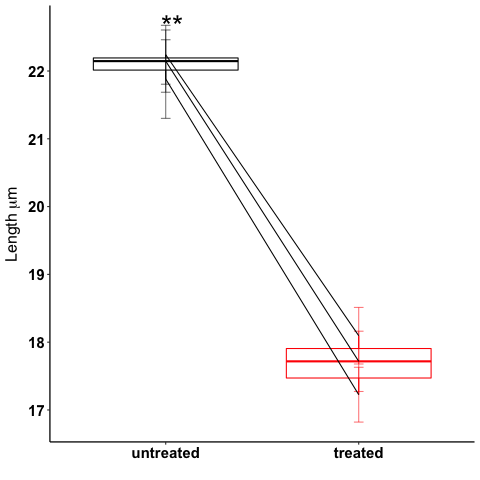
See the docs for ggpubr for more options (types of tests, pairing, etc.). This is a really awesome library. But this looks ok, however it could use some tweaking. Let's move the stars around and add the p-value and test name
ggplot(summarized_data, aes(x=names, y=mean_val, color=names)) +
geom_boxplot() +
geom_errorbar(width=0.05, aes(ymin=mean_val - sem_vals,
ymax=mean_val + sem_vals, alpha=0.4)) +
geom_line(inherit.aes = FALSE, aes(x=names, y=mean_val, group=samples)) +
color2_standard +
theme_and_axis_size +
stat_compare_means(method="t.test", paired=TRUE, label="p.signif", # edited
label.x = 1.97, label.y=23, size=starsize) +
stat_compare_means(method="t.test", paired=TRUE, size=statsize, # New!
label.x=2.05, label.y=23.5) +
labs(x="", y=TeX("Length $\\mu{}m$"))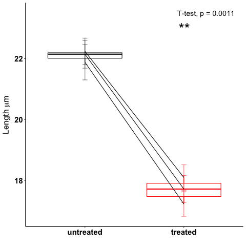 We added a new call to
 ggpubr to add the test name, and we moved both labels so they looked nicer.
Stats within ggplot2 and custom legend positions
Let's say we wanted to make a plot of the cumulative distribution for all the data. The cumulative distribution function (CDF) maps a value to the probability that a random variable is less than or equal to that value (you can also say, the function maps a value to its percentile rank. See Allen Downey's book Think Stats for an excellent, simple explanation http://www.greenteapress.com/thinkstats/ and wikipedia). You can approximate the true CDF by calculating the empirical CDF (ECDF) with R using the base function stats::ecdf().
However, ggplot2 also provides a number of methods for calculating and plotting data summaries like the ECDF with the stats_* layers. Let's use stats_ecdf to plot the ECDF.
Plotting the ecdf with ggplot2
  ggplot(data, aes(vals, color=names)) +
      stat_ecdf(geom="step", pad=TRUE) +
      color2_standard +
      labs(x=TeX("Length ($\\mu{}m$)"), y="Probability")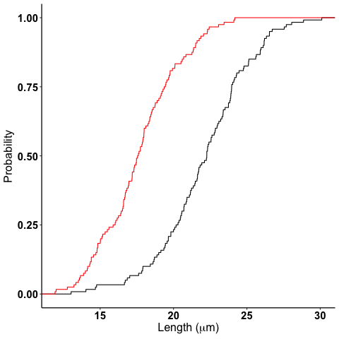
Custom legend positions
We previously removed the legend with our theme_and_axis_size presets. Here, we can add it back.
  ggplot(data, aes(vals, color=names)) +
      stat_ecdf(geom="step", pad=TRUE) +
      color2_standard +
      theme(legend.position="right")+
      labs(x=TeX("Length ($\\mu{}m$)"), y="Probability")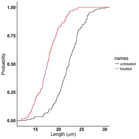
Looks ok, but I want to remove the title and move it to the left more.
  ggplot(data, aes(vals, color=names)) +
      stat_ecdf(geom="step", pad=TRUE) +
      color2_standard +
      theme(legend.position=c(0.7, 0.5), legend.title = element_blank())+
      labs(x=TeX("Length ($\\mu{}m$)"), y="Probability")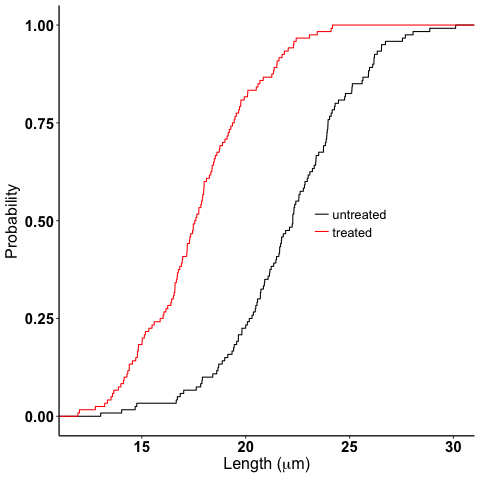
legend.position accepts coordinates, which are between 0 and 1, and relative to the bottom left origin (0,0) of the plot (legend position is well explained here).
Another great resource for legends and all other things R is the r cookbook website.
Kolmogorov-Smirnov Test
Want to compare the distributions with a Kolmogorov-Smirnov Test?
  test_vals <- filter(data, names == "treated")$vals
  control_vals <- filter(data, names == "untreated")$vals
  ks.test(control_vals, test_vals)
Two-sample Kolmogorov-Smirnov test data: control_vals and test_vals D = 0.6, p-value < 2.2e-16 alternative hypothesis: two-sided
tidyr::gather is confusing but useful
One function I have never been able to figure out is tidyr's gather. Every time I need to use it I try every permutation of arguments until I get it to look how I want it to.
Here is how it works. Let's say your data frame looks like this:
  library(tidyr)

  long_data <- data.frame("animal" = c("E1", "E2", "E3"),
                          "left_slope" = c(0.2,0.5,0.26), "right_slope"= c(0.3,0.4, 0.77),
                          "treatment" = c("control", "experimental", "control"))
  long_data
animal left_slope right_slope treatment 1 E1 0.20 0.30 control 2 E2 0.50 0.40 experimental 3 E3 0.26 0.77 control
I want to plot the slope with color indicating side (right_ or left_) for each animal and treatment condition.
tidyr's gather is great for this.
Here is how it works (arguments renamed by me for clarity):
gather(dataFrame, name_of_new_key_column, name_of_new_value_column, column_to_combine1, column_to_combine2, ...)
So if I want left_slope and right_slope values to be combined into a column, but keep the associated column name (left_slope, right_slope) as a key, I would type this:
  long_data %>%
      gather("slope_side", "slope", left_slope, right_slope)
animal treatment slope_side slope 1 E1 control left_slope 0.20 2 E2 experimental left_slope 0.50 3 E3 control left_slope 0.26 4 E1 control right_slope 0.30 5 E2 experimental right_slope 0.40 6 E3 control right_slope 0.77
Alternatively, You can tell gather which columns to not combine like so:
  long_data %>%
      gather("slope_side", "slope", -treatment, -animal)
animal treatment slope_side slope 1 E1 control left_slope 0.20 2 E2 experimental left_slope 0.50 3 E3 control left_slope 0.26 4 E1 control right_slope 0.30 5 E2 experimental right_slope 0.40 6 E3 control right_slope 0.77
giving the same result.
What's wrong with tidyr::gather
gather is not intuitive, and I think some of it comes from its permissive, flexible, parameter acceptance and strange defaults. For example, if I just pass the terms left_slope, right_slope, (quoted or unquoted, as gather supports quasiquotation), without specifying anything else, look what happens:
  long_data %>%
      gather(left_slope, right_slope)
left_slope right_slope left_slope right_slope 1 0.20 0.30 animal E1 2 0.50 0.40 animal E2 3 0.26 0.77 animal E3 4 0.20 0.30 treatment control 5 0.50 0.40 treatment experimental 6 0.26 0.77 treatment control Warning message: attributes are not identical across measure variables; they will be dropped
What in the world is going on???! The error message is unclear, but the really bad part is that the function ran despite me only providing two arguments to what at the very least should require four.
I have no idea why you would design a function to work like this. I think tidyr is quoting the first two arguments and using them as the name_of_new_key and name_of_new_value arguments (like you would expect with positional arguments), but upon looking closer at the documentation, I see that leaving the "columns" selection blank just selects all the columns and runs like everything is OK. This has led to way too much confusion for me and many others I work with, and I think demonstrates a case where the function should DEFINITELY fail and throw an exception rather than using this confusing default (why would you want to gather all the columns?).
I love the tidyverse, but it took me a long time to figure this one out.
I mainly wrote this for future me, and I am sure I will be back here next time I mess with gather.
This is a work in progress. As I come across other problems, I will add them here!